Styling
In order to customize the style of the measurement screen to match your brand identity, a stylesheet can be provided to control the colors and background images.
The Stylesheet
The provided sample stylesheet (docs/wms-styles.css) can be used as a template
to style the measurement page, the following classes can be customized (please
refer to the image below):
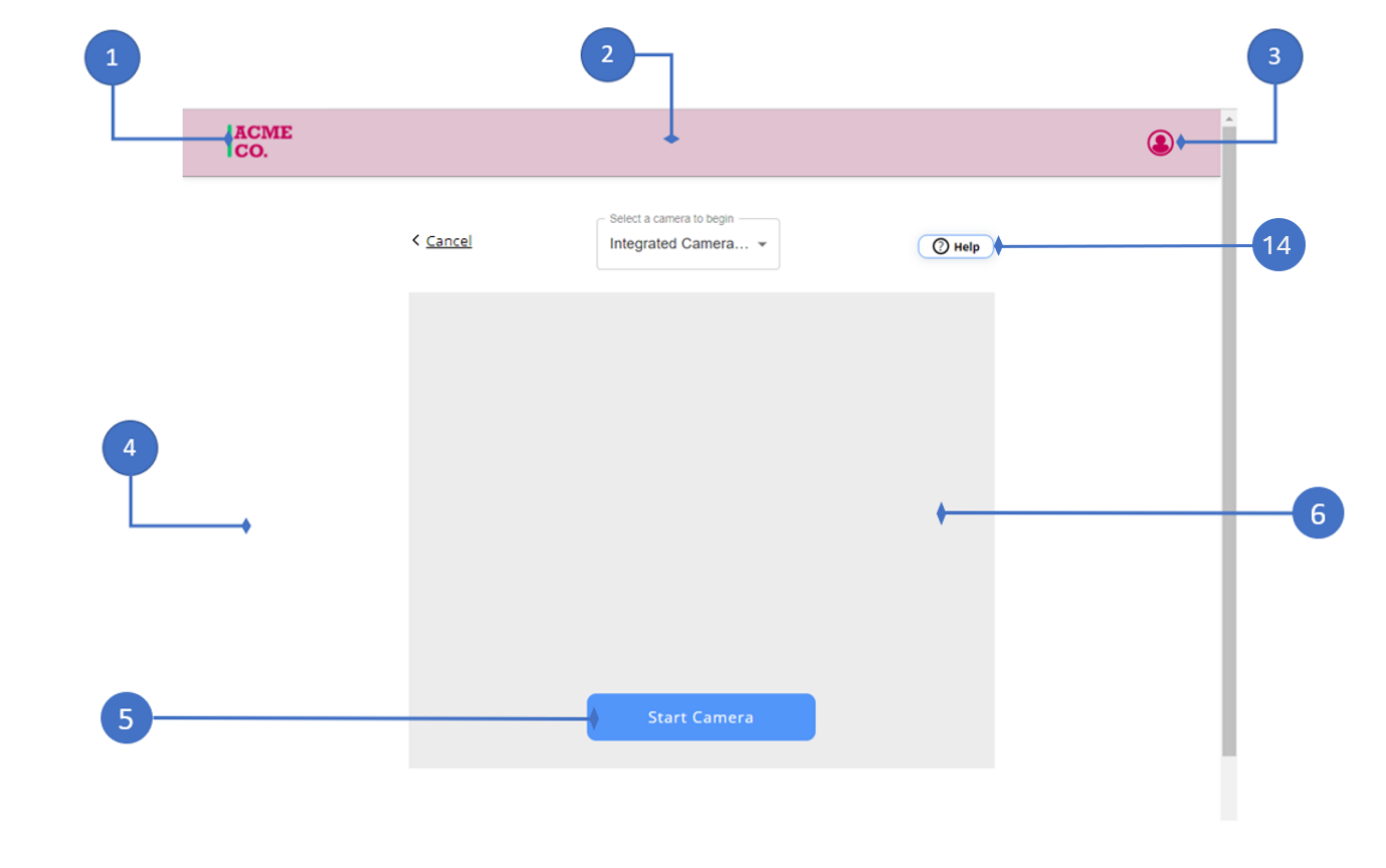
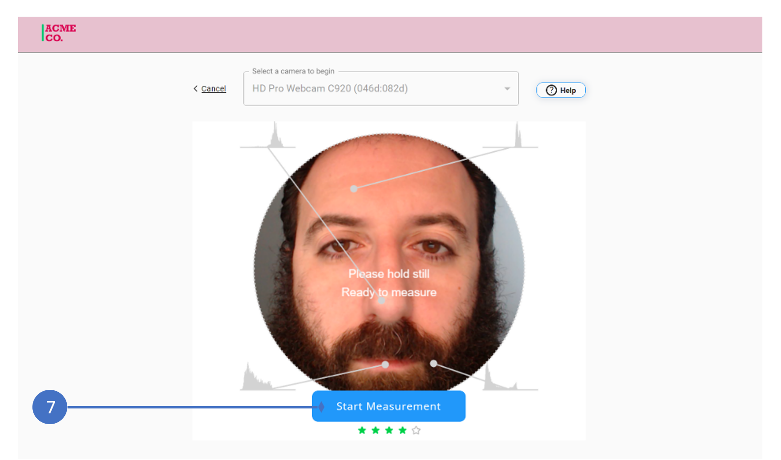
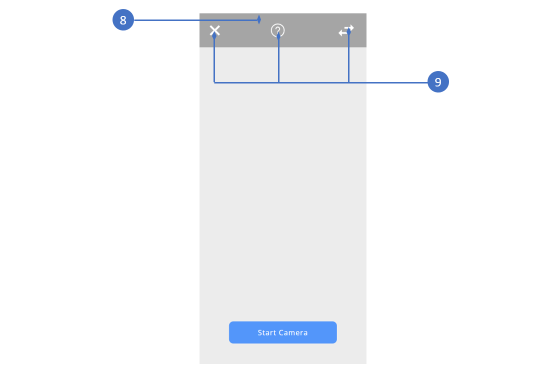
| # | CSS Class Name | Description |
|---|---|---|
| 1 | header-logo | Customize the icon, note that customization provided here will override the value set by the config link. |
| 2 | main-header | Customize the header of the page, a background color / image can be provided. display property can be set to none to hide the header completely. |
| 3 | header-icon | Customize the color of the header icon, display property can be set to none to hide icon. |
| 4 | main-body | Customize the background color / image of the main body of the measurement screen. |
| 5 | start-camera-button | Controls the Start Camera button. This can be used to control the background / text color, the width of the button and the text style. In order to control the different states of the button, classes for :hover and :active can also be specified. |
| 6 | measurement-canvas | Controls the background of the measurement canvas before the camera is started, a background color or image can be specified. |
| 7 | start-measurement-button | Controls the Start Measurement button. This can be used to control the background / text color, as well as the width of the button and the text style. In order to control the different states of the button, classes for :hover and :active can also be specified. |
| 8 | mobile-top-bar | Controls the background color of the toolbar at the top of the screen on mobile devices. |
| 9 | mobile-top-bar-icon | Controls the color of the buttons in the toolbar at the top of the measurement screen on mobile devices. |
| 10 | cameraSelectRoot | Controls the styling of the camera dropdown menu when unexpanded. |
| 11 | MuiMenu-list | Controls the styling of the camera dropdown menu when expanded. The background color of the list can be specified here. |
| 12 | MuiMenuItem-root:hover | Controls the styling of the individual menu items of the camera dropdown menu during mouse hover. |
| 13 | cameraMenuItem:focus | Controls the styling of the individual menu items of the camera dropdown menu when in focus. |
| 14 | measurementHelpButton | Controls the styling of the help button on desktop devices. |