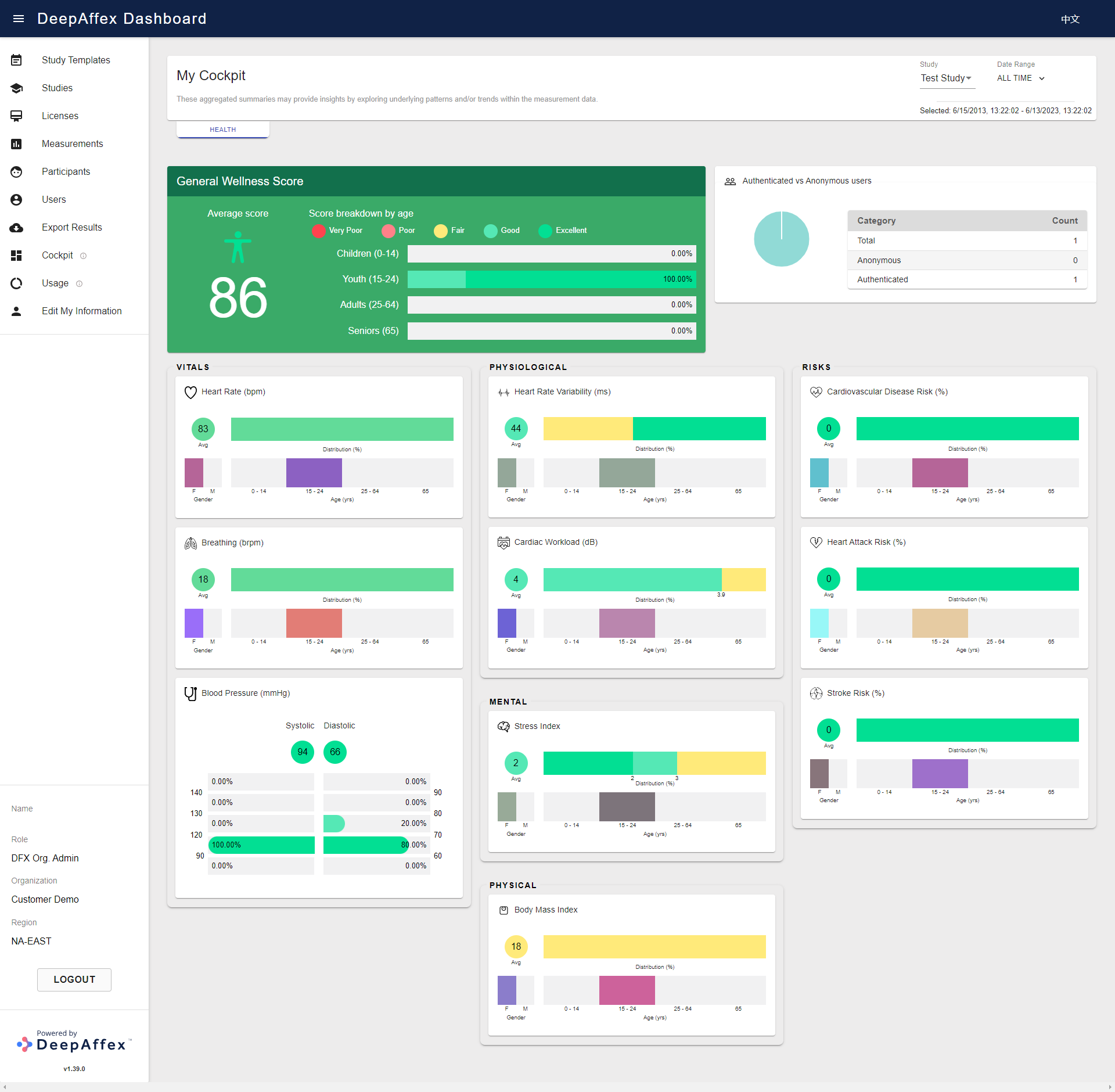
Cockpit
This section provides an overview of aggregate data for your organization in a
predefined report format. You can filter the aggregation scope by Study and
Date Range of measurement creation time. By default, it shows data for last
week.
This page is region-fenced, i.e. Org Admins and DFX Analysts can only view the aggregate data in their region.
The graphs indicate the distribution of the point results categorized by:
-
DFX Point Name (Heart Rate, Breathing, etc.)
-
Color coding specified in the interpretation table for each of the applicable DFX Point, it can be found in our DFX Points Reference
-
Percentage of each gender
-
Percentage of each age group
The graph also displays the average results based on the filtered aggregate data per DFX Point.
Authenticated vs Anonymous users section displays the number and percentage breakdown (as a pie chart) of the registered DFX users and anonymous users.
(Click here to open a larger version of this picture in a new window)